I felt that the title “Attractive things work better” was quite mismatched to the actual content of the text. Norman discussed how pleasurable designs are not necessarily usable. Subsequently, I find the title confusing as it contradicts what Norman said about the tensions that exist between attractive design and usability. Also, according to the title, I expected that the article would demonstrate how attractive design works better. Rather, he demonstrated how attractive design is more important in some situations than others (ex. high stress situation versus low stress situation). He didn’t explicitly explain how attractive design works better, or what he meant by attractive design. Is ‘attractive’ inclusive of beauty and usability? He simply kept repeating the idea that attractive things work better without offering a sound reasoning as to why that is the case. Although he made interesting claims about how negative and positive affects one’s mindset, and the relationship between design and neuroscience, I found his arguments to be underdeveloped. It was interesting information, but it wasn’t delivered coherently.
Month: February 2018
Emotion and Design: Attractive Things Work Better- Response
When I began reading this article, I was confronted with the statement: “If we were to follow Norman’s description, our designs would all be usable, but they would be ugly.” Immediately, I felt confused and kind of defensive. I saw no where in Norman’s work any indications that designs would end up ugly. As I continued reading, I realized that this point is argued, which made me feel better. The idea that aesthetic and functionality should go hand in hand made sense to me, so I did not consider for a second that Norman’s work excluded aesthetic value because it was not important. I simply assumed, as he later points out, that aesthetic is not mentioned because it is not the primary argument.
This piece lends a focus on behavior rather than design in particular. The affect and behavior of humans can dramatically alter their relationship with a design or task. Negative affect can make easy tasks harder, while positive affect can make difficult tasks easier.
Understanding this aspect of behavior and affect, it is clear that usability and function should be in balance to aesthetic and beauty.
The Design of Everyday Things- Response
I really liked this reading because I think it highlights parts of design which we assume are unspoken rules. Why would anything be designed without a purpose or function? Usability furthers the concept of function- a design shouldn’t simply have a function, but should function well. Norman goes beyond simply saying that designs should function well, he explains that the relationship between user perception and the design is importance through affordances and signifiers. He also highlights that not all designs are physical designs, which is important in considering that ‘interactive media’ does not always necessarily focus on the physical aspects of objects.
I liked the idea of the ‘system image’, the combined information available to us. Because it is so natural to simply apply previous experience into the handling of new designs, thinking about the combination of factors that combine to make said experience is interesting. This should be considered when designing my own products, because I need to differentiate between the experiences I personally have, as a designer, and the experiences that different users from different backgrounds will have.
‘Emotion & Design: Attractive things work better’ – Response
What Norman does in this reading is to emphasise the last line (like I mentioned in my previous response) of chapter 1 in The Design of Everyday Things, that clever design can minimise the paradox of technology.
What I find useful in this reading is that he goes back to look at the idea of aesthetic and how that relates to usability. Though in the last reading a lot of mention of the aesthetic side of design seemed to be considered to be bad or harmful to the utility of the object, here, Norman describes the opposite.
Perhaps controversially, I agree with both of his assertions for I believe that it really depends on the object that you are making and who is using it and for what purpose the object will serve. In this reading, he asserts that “good design means that beauty and usability are in balance”. Okay, but some objects don’t require the beauty aspect. But then again, there are other ones that require both beauty and usability for consumers to purchase them. I guess Norman, from the readings, gives us two perspectives on the design of objects, in which he recognises that psychology, whether of the inventor or for the user, plays a large role in dictating how effective the design of the object is.
‘The Psychopathology of Everyday Things’ – Response
This reading reminded me largely of some of the feedback that Aaron gave in class on our first assignments. He asked a lot of us in the class what the purposes of our projects were, and if there are any practical uses for them. As well (including during the feedback session for the second assignment), he also commented on the usefulness and how easy it was for the user to use that creation.
What the author of the text, Norman, does really well is in explaining why some designs, though may be aesthetically pleasing, do not work well. The author points to the ideas of visibility, affordance, conceptual and mental models, and mapping to explain the paradox of technology – which is the idea that “the same technology that simplifies life by providing more functions in each device also complicates life by making the device harder to learn and harder to use”. What I found interesting, in addition, was the author’s assertion that the paradox of technology “should never be used as an excuse for poor design”.
For me, the last line of the chapter, “added complexity and difficulty cannot be avoided when functions are added, but with clever design, they can be minimised”, is the essential takeaway from this reading. From Aaron’s feedback, I have already started to think about all my projects in the sense that they could provide a practical use (in such a way that a product could actually be developed, produced, and sold). The reading emphasised this mindset and consolidated the idea that there is a need for good designs.
“There Are No Electrons” Reading
I absolutely loved this reading. When I joined this course I was extremely confused by the overall concept of electricity. We discussed so many terms such as voltage, current and power but I still didn’t have a holistic understanding of the terms beyond its textbook definitions. Electricity in general always confused me as well, it appeared like such an intangible subject that I didn’t know what to do with just having a textbook definition of it. Not only did the author make the subject extremely relatable and understandable, he went further to question the concept of the electron theory, or what really holds protons together in a nucleus. I appreciated his questioning and sort of rebellion towards the current scientific understanding of electricity. Also, as strange as his “dreams”, or creative stories were, it offered a brilliant, relatable point of view. I found his writing questionable initially and undermined the value of what he had to say, but after reading the “The Creative Use of Jargon” I could understand why he was writing in an un-scholarly way. I was also deviated by the length of the text, and perceived it as almost a burden. However, it’s one of the only science readings that I understood holistically and enjoyed. He did a fantastic job of making the material so tangible and approachable.
“The Art of Interactive Design” Reading
I didn’t realise how overused and misunderstood the term interactivity was until I read this text. At one point I did wonder whether the author was maybe over-complicating the definition of interactivity and making it more complex and unavailable than it has been for an element of exclusivity. Nonetheless, he stated excellent points and revealed distinctions that I would not have thought of. One of my favourite points was on the subjectivity of interactivity. He gave an example that when the refrigerator door opens, a light turns on. Though some people will not be entertained by this game, small children find the refrigerator light more entertaining and interactive. Subsequently, as beauty is in the eyes of the beholder, does interactivity exist in the eye of the interactor? I also liked how instead of referring to interactivity as a black or white subject (ex. there is either interactivity or no interactivity), he explained it as a subject with relative measures (ex. high interactivity or low interactivity). My favourite part was when he made distinctions between interactivity, intense reaction, and participation, as I always saw blurred lines within those definitions. I also appreciated the author’s humbleness in terms of admitting that the idea of interactivity is too complex to fit some reduced, limited defition, and therefore the definition may not be appropriate. At one point I started to question as to why it feels like we are aiming for interactivity, what is so special about it? Why is it better than intense reaction or participation? The author did not say explicitly it was any better, but he did imply it was. For instance, when he stated that smaller class sizes increase interactivity between student and teacher, and the student-to-teacher ratio is one of the best simple indicators of the quality of a school, he implied an increase in quality can be achieved through interaction. Nonetheless, it was a fascinating text to read.
“Jump to Universality” Reading
I found the examples that Deutsch used in the text to be fascinating, as I had never perceived, for instance, language and the numeric system in such a way. The explanation for some examples were difficult to comprehend. For instance, when discussing language he claimed “a rule works by exploiting regularities in the language, it implicitly encodes those regularities, and so contains more knowledge than the list.” What did he mean by “exploiting regularities” and “implicitly encoding”? Some ideas were hard to comprehend because he communicated in such abstract terms, not always with further explanation. I found the general, overall message to be extremely interesting. How small changes in a system to meet a narrow purpose happened to contribute to the universality of something, without intentionally meaning to contribute to universality. I always thought universality was intentional. Instead, I learnt we didn’t achieve universality by trying to deliberately make something universal. It was interesting how he offered a very limited explanation for why communities didn’t attempt to reach universality earlier, why they were avoiding universality on purpose. The one explanation that stood out to me from the few was the fact that the communities’ livelihood would be threatened by a system that was too easy to learn. Perhaps the increase in trust, or the colonisation and globalisation of the world, makes it less threatening to aspire for universality.
Assignment 1 & 2
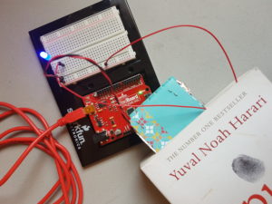
- I first started off with plugging jumper wires into the ground and 5V input on the RedBoard to the power and ground column on the breadboard. Vittoria taught me a neat trick, twirling wires together in order to keep the board neat and clean.

2) I tried to test if the LED pin would light up if I put the two jumper wires against a conductive material (in this case, I made the jumper wires touch one another), and it did successfully.

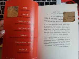
3) I decided to go on with my idea, which was that whenever I opened or closed a book, the light would switch on or off. I decided to tape the jumper wires to small conductive sheets, and then tape them on the pages, as demonstrated below. When the book is closed, the lights would turn on, and when the book is open, the lights would turn off.

However, I found my idea to be slightly useless. Firstly, the conductive sheets were only on the first two pages. What if the reader opened another page? Nothing would happen with the LED light. Also, a LED indicator of when the book is open or closed essentially has no purpose as my hands can also indicate when the book is open or closed. After talking to Professor Aaron about my idea, he suggested that I create a reading lamp that turns on when the book is open, and turns off when the book is closed.
4) In order to execute this plan, I decided to create two bookmarks covered in conductive material. One is called a bookmark, while the other is called a lamp switch bookmark. The bookmark is placed on whichever page the reader is on, and the lamp switch bookmark is placed on the original bookmark when an individual is reading. When an individual is not reading, the lamp switch bookmark must be set on a different page so the conductive material does not touch and the LED doesn’t light up.
a)  b)
b)
c)
(Bookmark and lamp switch bookmark making contact with one another so the LED lights up)
What was problematic with this plan was that it did not meet the hands-free requirement that was asked for this assignment. I needed another way of making the LED light up when the book was open.
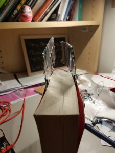
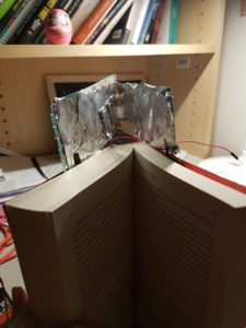
5) Before I explain what I did in order to make the LED light up when the book was open, it would be helpful to take a look at the images:
a)

b)

c)

I changed the position of the bookmarks into a landscape position and put them on top of the novel, near the spine of the book. Subsequently, when the book is closed the conductive material does not touch. When the book is open, the conductive material makes contact and the LED lights up. A possible issue with this design may be the storage of the book. The bookmarks add extra length to the novel, therefore it may have trouble sitting on a shelf. Also, the jumper wires were quite short and therefore it was challenging to actually test whether the concept worked or not. Unfortunately the image couldn’t capture the LED light on while the novel was open, but it does work.
Assignment 2
Adding to my project from last week, I tried to give it a purpose and thought that it could be turned into a game in which you step on the semi-cylinder to make the ball jump and land on the aluminium foil on the other side of the box. I have used the Arduino to make the LED light up if the tennis ball touches the aluminium foil exactly and stay lit until the ball slides back down and touches the foil at the starting point.
Here is the code that I used: https://gist.github.com/yhk343/91b72544f0e0a46444641a15c4de6d88
