Self Portrait

Here is the self-portrait:

code:

fill (#F5D8B2);
rect (150, 100, 300, 200);

stroke (#F5D8B2);
ellipse (300, 300, 310, 400);

stroke(0, 0, 0);
fill(#FFFEFC);
ellipse(230, 250, 75, 25);
ellipse(375, 250, 75, 25);

stroke(0, 0, 0);
fill(0, 0, 0);
ellipse(230, 250, 25, 25);
ellipse(375, 250, 25, 25);

line(300, 325, 300, 300);
line (300, 325, 320, 330);

stroke (0,0,0);
fill (#FCE3FA);
ellipse(300, 400, 75, 50);
stroke(#C90003);
fill(#C90003);
ellipse( 300, 415, 50,25);

stroke(#3B2512);
fill(#3B2512);
rect(190, 200, 90, 20);
rect(330, 200, 90, 20);

stroke (#BC2427);
fill(#BC2427);
ellipse (250,100,400,100);

stroke (#7C1517);
line (100, 150, 100, 600);
line (400, 500, 400, 600);
line (530, 100, 530, 400);
stroke(#E54346);
line(500, 150, 500, 500);
line (130,100, 130, 600);
line (230, 500, 230, 600);

I did a lot of layering on simple shapes and tried to make the overall shape of each element slightly more complex, for example my face is a square followed by an ellipse to form the slightly awkward cheeks. One of the bigger struggles I had was with the eyebrows and nose as I found it hard to figure out the angles of each line. Other than that it was just time consuming, but relatively fun, work.

Doll Spin

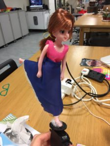
I don’t know where exactly the idea of a spinning doll came from, but my guess is from those jewelry boxes with the spinning ballerina and the music.

My project was extremely simple this time, I accidentally used a servo instead of a DC motor. Though, if I spent time fixing it I’m sure that I could make it work just as well with a DC motor.

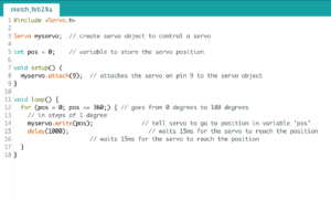
The doll I bought from Daiso. I made the skirt (poorly) using extra fabric and hot glue. Below is the coding:

I used an online example and tweaked it in order to fit my continuous servo. The original code would make it turn 180 back and forth.

Here is a picture of the final product:

Physical Computing ‘s Greatest Hit’s and Misses – Response

This article was an good list of inspiring installations that I will definitely return to when thinking about my final project. I found particularly interesting the pixel installations. Perhaps this is because I tend to appreciate the more aesthetic projects rather than amusing or creative ones.

I think it introduced some interesting concepts such as the gloves, it was interesting to see how “simple” coding can create fun and interactive installations.

I don’t really have much to say about this article. I think overall it was interesting to read and it linked some ideas to really amazing examples.

Making Interactive Art: Set the Stage, Then Shut Up and Listen – Response

I enjoyed this article, not only because it was short, but because it reminded me of something that Aaron said in the beginning of the semester that is crucial to IM. During the first lesson he said (I’m paraphrasing here) “I consider myself first and foremost an artist”. This stuck to me and this article is able to communicate a crucial part of being an artist: being able to have your work interpreted. In the sciences and other courses such as engineering, one is often forced to conform to the idea of right and wrong and thus the flexible aspect of IM attracted me.

The fact that one should not prescribe a meaning, a way that an audience should interact and what kind of experience one should get from the project is critical. If one were to prescribe the way in which to interact with an installation, the installation becomes less of an interactive piece, rather it becomes an exhibition.

“Joey doesn’t share food” – Documentation

My idea first sprung in to my mind from desperation. However, as I was watching Friends at the time, I knew that there were some great one liners that would make people laugh. Thus, I knew that I wanted to include this aspect into my project. I hoped that by exposing the audience to the familiar phrase “Joey doesn’t share food” some would be amused by the project. The idea was to create a pressure pad that would allow the user to place their food on it. If the mass of the food were to change due to someone else taking some food off the plate, a speaker would sound and the familiar “Joey doesn’t share food” phrase.

The first step was to create the pressure pad. I researched online some ways that I would be able to do this. On Youtube I found a couple of different ways, one of them was through some conductive foam:

This way did not work as I had hoped, the electricity would only conduct when the foam was pressed with extreme pressure and due to the nature of the foam the input values changed too much. The values were also at a great  range so smoothing them out would not solve the problem so easily.

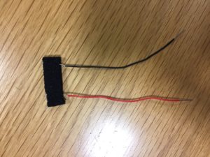
I then found a tutorial for making a pressure pad, the concept was simple enough and thus I made a prototype:

Unfortunately this ended up being a mere switch which is not what I wanted.

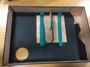
Lastly, I chose to use a pressure switch. At first I avoided this due to the size. It was too small for the idea that I originally had in mind. However, I was able to solve it by creating a platform that would concentrate all of its forces on one spot.

For the sound I was able to rent an mp3 shield. I soldered the shield and with the patience and help from Adham I was able to download the mp3 sound I wanted and programmed the redBoard to trigger the sound when the input from the pressure sensor changed by a factor or 10.

The physical box I created was designed using illustrator and laser cut. I believe the material is plywood. I regret not measuring the thickness of the wood as the wrong measurements destroyed the aesthetics of the box. I originally wanted to add springs in order to give the platform some give. However, I could not locate any and came up with a better solution. I decided to stable pieces of stretchy fabric to the bottom of the wood base.

Originally I planned on making the box bottomless, however due to the sensitivity of the sensor I had to cut out a loose bottom to make sure that I could open it and plug things in as well.

Here is a video of the final product:

“Responses: A Brief Rant on the Future of Interaction Design” – Response

Victor offered a variety of valid counter-arguments for some of the “faults” in his rant (I didn’t even think they we’re big faults if I’m being honest), but I don’t know if I have much to say when considering whether I’m satisfied with him not having a solution. I can accept many of his initial arguments due to his experience in the field. So, if he cannot come up with some solutions, I don’t know whether the rant was worth it.

I acknowledge his input of the use of other motions in his previous post, but when considering solely this one: I appreciate his one sentence solution about wearing gloves in order to have a sense of where one’s hand is in a 3D interface. I wish he would expand more on that, the idea of another crucial piece of technology which we have to cary intrigues me. I’m sure that his speaking out about this problem will improve some researchers thoughts or interface. But because I enjoyed his way of thinking and his arguments, if I were a developer I would be grateful for some inspiration.

Good Read.

A Brief Rant on the Future of Interactive Design – Response

My initial thoughts when first viewing the video were “wow, that looks so aesthetic, cool and clean”. But then my mind drifted towards the ideas that earlier readings brought up, which were how future technology must think of human nature. It is not human nature to be so organized… Alright, well at least not my human nature.

I agree with Victor that the technology must be able to be a sort of extension of our own body and be able to use our senses in order to function. But then, would it not be extremely awkward and nonsensical to use one’s entire body when operating technology in public? I’m not thinking opening a door, but rather operating your own individual phones or computers.

Though, I do still agree in many ways with Victor when considering the future. Especially since that phone one of the men was holding looked extremely fragile. Victor also brought up some interesting points about different motions of the hands which may be more reasonable than using one’s whole body. Our fingers allow for discreet and private motions for complicated tasks, so rather than “using only our finger” we get to “use only our finger!”. But perhaps people will get accustomed to different motions as well. It is human nature to adapt…

Emotion & Design: Attractive Things Work Better

I believe it’s pretty clear from my last blog post that I agree with the arguments presented in this article. Though he repeated many of the points that were mentioned in his book, the concentration on the cognitive aspects was interesting.

Towards the end, when he mentions the Japanese lunchboxes or bentos, the concept truly came together for me. As I am familiar with the concept of a bento box and it’s aesthetic values. Bento boxes are nutritiously balanced, extremely pleasing (aesthetically), delicious and the amount of food is also perfected. The example was able to very simply explain the harmony that must occur between all parts of a product.  Overall, I don’t have much more to say about this piece except that it was easily understandable.

The Psychopathology of Everyday Things – Response

There was a point in the reading where Norman talks about how a bookmark placed in a book can be a signifier. How it shows the amount of pages that are left until the end. How when a student places a bookmark they are confronted with the idea that there are ‘n’ number of pages left until it’s finally done. This was extremely relatable when reading his piece.

Although sometimes the piece seemed to drag on and Norman seemed to be repeating his point and explanation over and over again, his arguments are solid. In his conclusion about how a good design is the combination of various fields and the understanding of human nature made a lot of sense to me.

I’ve had many discussions with my brother about using Androids and how they are more ‘efficient’ and have higher capabilities. However, as a loyal iPhone user, I find the appeal of the phone not centered around its usability but also its aesthetics, simple to use and easy to understand interface, compatibility with other devices etc. . Perhaps it’s human to like simple and pleasing rather than ugly but efficient.

Also, I found it funny how he was describing a watch that had social media and smartphone like capabilities because all I kept thinking was: Apple Watch!!!

. . –

I thought about what ‘unexpected’ was supposed to entail for a long time. I was thinking about what could be ‘unexpected’ from an LED and all I thought about was it not blinking. After much contemplation, I began to think about using a photosensor. My first inspiration was glasses that would shine a light when it was dark, for no reason. But then I began to think of when glasses/goggles would be used along with light. My first thought was of mine workers. Soon my mind (unfortunately) drifted towards morbid thoughts, like how some mine workers would be stuck in the dark if the mine caved in. Considering the recent news, I also thought about the earthquake in Taiwan that trapped several people in rubble.

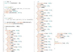
Soon enough, I decided to make a photosensitive light that would morse code H-E-L-P when the surroundings are dark. I made it in hopes of allowing victims to be more easily found, as people cannot scream for help for a long time.

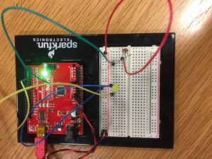
I set up the RedBoard ‘normally’:

I then looked online on how to morse code H-E-L-P:

H = dot, dot dot, dot , E = dot , L = dot, dash, dot, dot , P = dot, dash, dash, dot

With some help, I was able to code the following (sorry for the bad quality, will learn how to use the website for next time):

This is the video of it working: