Lev Manovich – Response

This reading was well organized and it should’ve made a lot of sense. However, I think because of the complex vocabulary I was often lost. I believe that this reading does build off of each point and make sense in terms of what it set out to do. I wish that I was able to follow it more. The concepts were explained in a manner that was tailored to suit someone who was familiar with the technological terms that are common, but even those I had to think about when reading which interfered with the fluidity with which I could understand the concepts.

One point that I did find interesting was the one about the advertisements and how computers seem to analyze the data that we give them. We know that this is happening but it was interesting to read about. Also the point where everything is built off each other, how programs and new media always use things from the last generation. I don’t know what else to say about this as I was unable to fully grasp each concept.

Chance Operation – Response

I found this talk incredibly interesting in regards to the merging between softwares and visual arts, because that is a personal interest of mine. His reference to Marshall McLuhan, “we shape our tools and thereafter, our tools shape us”, can be seen as moving further than just software and more into media in general. What I understood from it was that we can try to create something that in return will help us create and produce from it. In terms of software, this is applicable due to the way that we now use the same software to produce art.

Although I enjoyed some parts of the talk, I did not find it engaging, mainly due to the tone of the speaker. However, I cannot help but take away the artistic possibility of working digitally and with software. The examples he showed were incredibly cool and made me think about the type of art I want to see and create.

Casey Reas’ Eyeo2012 Talk – Response

Though sometimes I feel that Reas could have articulated his ideas just as clearly as he did without quoting another artist/influential figure, one line that he did say that I think sums up his talk is, “Artists maintain order in the face of nature”.

Though he doesn’t expand upon what he means by this idea, one of the words I would like to play emphasis on is “maintain”.  Going through many examples of projects, Reas talks about the idea of combating chaos and resolving order; how there is a constant phenomenon of keeping order even if the what is seen seems to be pure chaos. The idea of keeping constant and maintaining a set structure seems to become the basis of design and computing.

I think his point is not only relevant in the case of design and computing, however, it applies to the wider context. One of the main ideas that I got from his talk is the idea that for something to work well, it must have order and a thus a good structure as a base. I felt that his talk was indirectly a life lesson as well.

Overall, I found it interesting how he described the projects that he had made and his explanations of how they linked to the “real world”.


Lev Manovich Reading – Response

I really enjoyed the part in the reading when Manovich was talking about how by the end of the 20th century, there was a media evolution which basically garnered a large need to generate new technologies to store, organise and efficiently access media materials. This reminded me a lot of what my other class, Future of Medicine, were discussing in relation to genome sequencing: how there would be such large amounts of data that would be gathered (big data) and though we have the opportunity to do genome sequencing, the problem is to do with the storing of the data as sequencing one person’s genome would take up terabytes. It seems that as society becomes more technologically advanced, so too does the technology to store and organise information.

The part about variability and the generation of many different versions of something reminded me of the computer graphic recreation project that we presented on Monday and I think the projects highlight Manovich’s explanations of the difference between old media and new media well (in the sense that new media creates versions that are automatically assembled by a computer, shown through random and noise functions).

The Language of New Media: Response

Although I found this a bit of a challenging read because of the jargon, I think some points made throughout the piece were quite logical and rosonated with me. In talking about new media, I think it was interesting the way he divides it into subsections of what it ‘should’ have. The examples used in terms of film and language (and semiotics) made his point of numerical representation more clear to me. I also found the part about removing the human from the creative process interesting, and instead replacing it for automation. His identification of ‘low-level’ and ‘high-level automation shows the difference between different types of automation and what they can mean according to context. I also enjoyed his reference to McLuhan, because I think a lot of his media theory is still valid and applicable in media studies.

Casey Reas’ Eyeo Talk Response

I found some parts of this talk extremely engaging. However overall, it was quite disengaging as I found a lack of passion in Reas’ voice, which made it challenging to devote my full attention to the video. I liked how Reas stated that for a rational machine to do something unexpected was pretty subversive back then, but at the same time, it’s also pretty awesome. I really like the intersecting ideas of the ‘rational’ and ‘irrational’ in computer graphics. I also resonate with the artist Reas mentioned, who claimed that exploration of the grid can be seen as moving away from humanity, moving away from narrative. This is something I find puzzling and problematic about computer graphics, and most art today in general. When we abstract an idea so much that the narrative is removed, I do not see the purpose in art. Another question that arose while I watched the talk was that if I am not in total control of the artwork that is being produced, if I do not even know the possible result I desire, am I even the artist? Do I have the right to call solely myself the artist, or is it the duo of the man and machine? This video highlighted interesting ideas that I would love to reflect on and discuss further.

The Language of New Media Response

I found this text interesting but also quite challenging to read. There were many definitions and concepts I had to keep searching up, I felt that there was a lack of context for a general reader’s understanding. An idea that I found to be profound was how modern media was described. The author explained that it had discrete levels because it emerged during the Industrial revolution, and how modern media evidently follows the factory logic. I really liked the connection between social changes in the 19th century and art. The claim “to understand the logic of new media we need to turn to computer science” allowed for a greater appreciation for the work I am doing in the Intro to IM class.

Self Portrait Project

Self portrait

I wanted to create something aesthetically appealing  and minimalist with my self-portrait. When Aaron mentioned this project, I thought of the illustration I make every time I create cards/letters:

I wanted to create something along these lines, but not the same illustration with the flowers on my eyes. I wanted to incorporate my glasses, as I believe that is an essential part of my outer appearance. I wanted to create the same style of my hand-illustrated face, which has minimalist shapes to demonstrate complex parts of my face, such as the simple curves that represent my cupid-shaped lips. Hence, I used the line and arc tool plenty of times. Figuring out a minimalist shape for my nose and mouth was much harder to think of digitally than it is when I hand illustrate it. I wanted my lips to be shaped differently, something distinct from the stereotypical happy/neutral emotion. The arc tool was incredibly difficult to use, but it was a satisfying challenge.

I wanted to make the project interactive. A way I thought of doing this was having a bubble gum expand from my mouth once it is clicked. Once it fills the screen, it would pop and return back to its normal size. This was incredibly difficult to code. Although I got the bubble to expand once it was clicked on, I was not able to make the bubble return back to its normal size. Because I was coming back late from break, I suspected I wouldn’t have enough time to fix the issue, so I decided to go ahead with an non-interactive design. I wanted to show the bubble gum code on this post, however my laptop got re-imaged and I lost the code as I didn’t back it up.

It was also extremely difficult to create hair. I wanted to illustrate long hair in strands (as seen on my hand illustration), but wasn’t sure how to go about it. Hence, I decided to go for the high-bun look and have a bandana, as simply an ellipse shape on top of my head did not look natural.

I also found it interesting that the lines and arcs in Processing are not vector-images. They have a colored background, for instance the arc had a white rectangular background. I am not sure how effective that is when creating an art project, but it was nonetheless an interesting discovery. I wonder why it isn’t a vector image.

I actually really enjoyed using Processing to create artwork. This was my favorite project yet this semester.

Code for my project:

void setup(){
  size(480,640); 
  frameRate(5);
}

float radius;

void draw(){
  background(0, 0, 0);
  
  fill(0);
  stroke(255);
  ellipse(240,325,730,800);
  stroke(255);
  ellipse(240,325,630,700);
  stroke(255);
  ellipse(240,325,530,600);
  stroke(255);
  ellipse(240,325,430,500);
  stroke(255);
  ellipse(240,325,330,400);
  stroke(255);
  ellipse(240,325,230,300);
  
 
  fill(255);
  stroke(0);
  ellipse(240,200, 150, 190);
  
  fill(255);
  ellipse(115,350, 50, 80);
  
  fill(255);
  ellipse(365,350, 50, 80);
  
  fill(0);
  ellipse(100,370,5,5);
  
  fill(0);
  ellipse(100,370,5,5);
  
  fill(0);
  ellipse(379,370,5,5);
 
  
  fill(random(0, 204), random(0, 255), random(0, 255));
  ellipse(240,330,275,350); //x,y,w,h


  fill(255);
  ellipse(240,360,275,350); //x,y,w,h
  fill(random(0, 255), random(0, 255), random(0, 255));
  ellipse(300,340,75,75); //glasses 1
  fill(random(0, 255), random(0, 255), random(0, 255));
  ellipse(180,340,75,75); //glasses 2
  line(216, 340, 264, 340); //middle portion of glasses
  line(104, 340, 141, 340); //side portion of glasses
  line(336, 340, 375, 340); //side portion of glasses

fill(255);
stroke(0);
arc(240, 410, 50, 35, PI, PI+QUARTER_PI);
arc(225, 410, 20, 20, HALF_PI, PI);

arc(270, 450, 170, 50, HALF_PI, PI);
arc(170, 440, 50, 35, PI, PI+QUARTER_PI);

arc(260, 485, 100, 10, HALF_PI, PI);
arc(260, 470, 50, 30, PI+QUARTER_PI, TWO_PI);
arc(210, 460, 60, 30, PI+QUARTER_PI, TWO_PI);

fill(0);
ellipse(225, 410, 3, 3);

//fill(0);
//stroke(255);
//ellipse(240,150,115,130);

stroke(0);
line(257, 410, 255, 380);

}


Recreating Computer Graphics

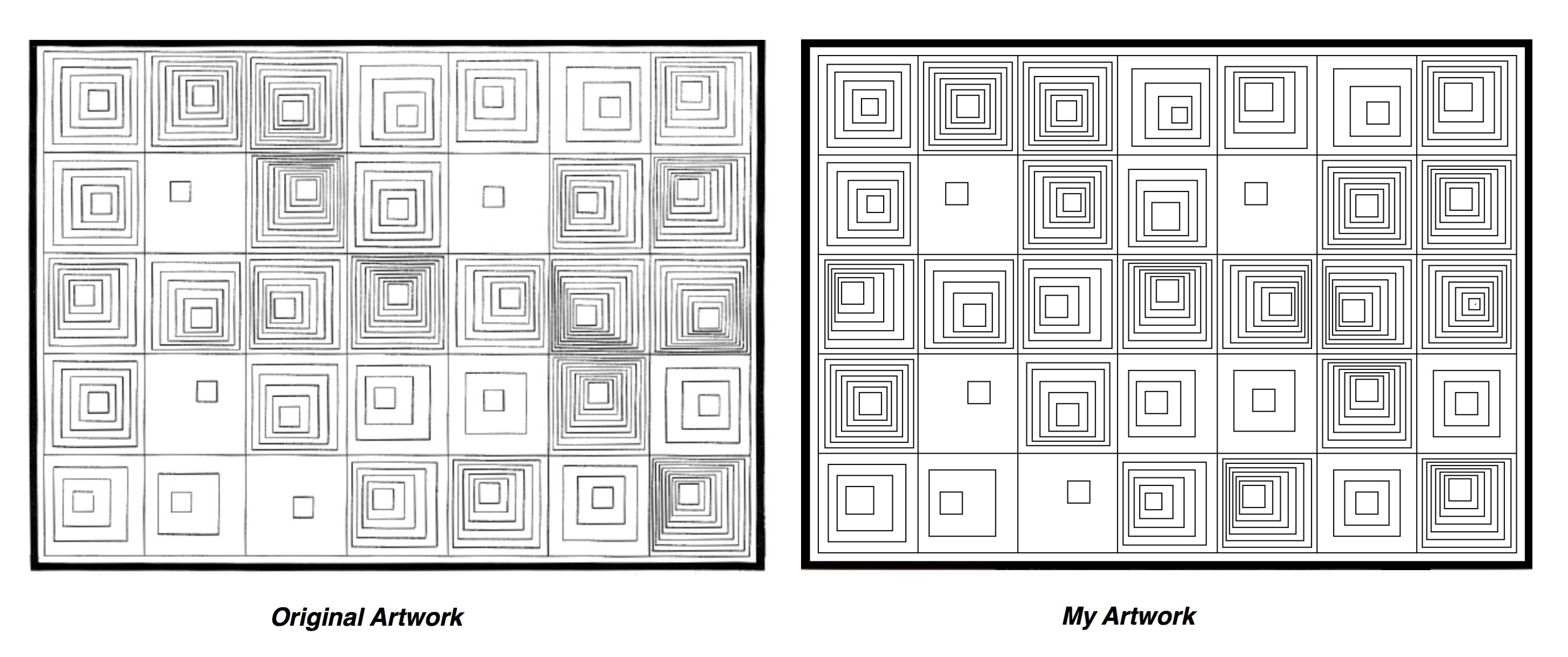
I chose to replicate this artwork because the particular pattern and organisation of the shapes provided some sort of comfort to me. I liked the aesthetic appeal of the repetition of squares. I initially set up the grid and border by using the line (for border) and rectangle (for grid) tool.

The challenge was that each square on the grid has its own pattern. In total, there were 35 different styles I had to account for. I decided that the most efficient way to code would be to create a for-loop for each square. This was the for-loop I decided to use for square #1 in the first row:

for (int i=0; i<6; i++){
  rect((21+7i),(200+5i),(80-12i),(80-12i));

However, the for loop didn’t work. I later asked Aaron what the problem could be. He told me that I couldn’t multiply ‘i’ with a number by placing it next to a variable, I had to use the ‘*’ sign. It was a small error, but because I couldn’t figure it out on time I had hard-coded 80% of my project, which resulted in my code being long and inefficient. It was also extremely time consuming, but it also felt quite surprisingly meditative to hard code this project.

I also assumed that the dark values created by some of the rectangles (ex. below) would not be created by the rectangle tool, but the line tool and change in stroke weight. Hence I was skeptical of using the rectangle tool instead of the line tool throughout the process. But I was also afraid to use the line tool because of how incredibly time consuming it would be (in addition to hard-coding). I was surprised to find that the values can be created by the rectangle tool depending on how close the shapes are to each other, which gives the illusion of darker/lighter values.
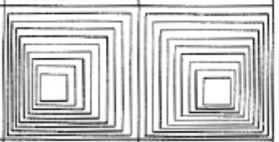
from original artwork

The code for my project:

void setup(){
  size(660,480); //w,h
}

void draw(){
  background(255,255,255);
  
  //border
  strokeWeight(15);
  line(0,0,660,0);
  line(0,0,0,480);
  line(660,0,660,480);
  line(0,480,660,480);
  
  //square skeleton 1st row
  strokeWeight(1);
  rect(15,15,90,90);
  rect(105,15,90,90);
  rect(195,15,90,90);
  rect(285,15,90,90);
  rect(375,15,90,90);
  rect(465,15,90,90);
  rect(555,15,90,90);
  
  //SS 1st column
  rect(15,105,90,90);
  rect(15,195,90,90);
  rect(15,285,90,90);
  rect(15,375,90,90);
  
  //SS 2nd column
  rect(105,105,90,90);
  rect(105,195,90,90);
  rect(105,285,90,90);
  rect(105,375,90,90);

  //SS 3rd column
  rect(195,105,90,90);
  rect(195,195,90,90);
  rect(195,285,90,90);
  rect(195,375,90,90);
  
  //SS 4th column
  rect(285,105,90,90);
  rect(285,195,90,90);
  rect(285,285,90,90);
  rect(285,375,90,90);
  
  //SS 5th column
  rect(375,105,90,90);
  rect(375,195,90,90);
  rect(375,285,90,90);
  rect(375,375,90,90);
  
  //SS 6th column
  rect(465,105,90,90);
  rect(465,195,90,90);
  rect(465,285,90,90);
  rect(465,375,90,90);
  
  //SS 7th column
  rect(555,105,90,90);
  rect(555,195,90,90);
  rect(555,285,90,90);
  rect(555,375,90,90);
  
  //1st square
  noFill();
  rect(23,23,75,75);
  rect(30,30,60,60);
  rect(38,38,45,45);
  rect(46,46,30,30);
  rect(54,54,15,15);
  
  //1st square 2nd row
  noFill();
  rect(23,112,75,75);
  rect(32,120,60,60);
  rect(42,128,45,45);
  rect(50,136,30,30);
  rect(59,142,15,15);
  
  //1st square 3rd row
    rect(21,200,80,80);
    rect(24,204,68,68); 
    rect(27,208,56,56);
    rect(30,212,44,44);
    rect(33,216,32,32);
    rect(36,220,20,20);
    
  //1st square,5th row
  rect(24,385,70,70);
  rect(32,395,50,50);
  rect(40,405,25,25);
  
  //1st square, 4th row
  rect(21,290,80,80);
  rect(26,295,70,70);
  rect(31,300,60,60);
  rect(36,305,50,50);
  rect(41,310,40,40);
  rect(47,315,30,30);
  rect(52,320,20,20);
    
  //2nd square
  noFill();
  rect(110,21,80,80);
  rect(115,26,70,70);
  rect(120,31,60,60);
  rect(125,36,50,50); 
  rect(130,41,40,40);
  rect(135,46,30,30);
  rect(140,51,20,20);
  //rect(145,56,10,10);
  
  //2nd square 2nd row
  rect(130,130,20,20);
  
  //2nd square 4th row  
  rect(150,310,20,20);
  
  //2nd square 5th row
  rect(115,390,60,60);
  rect(125,410,20,20);
  
  //2nd square 3rd row
  rect(111,200,80,80);
  rect(119,210,65,65);
  rect(128,220,50,50);
  rect(137,230,35,35);
  rect(146,240,20,20);
  
  //3rd square
  noFill();
  rect(200,21,80,80);
  rect(205,26,70,70);
  rect(210,34,58,58);
  rect(215,40,48,48);
  rect(220,46,38,38);
  rect(225,51,28,28);
  rect(230,56,18,18);
  
  //3rd square 2nd row
  rect(200,110,80,80);
  rect(205,115,70,70);
  rect(210,120,60,60);
  rect(218,125,46,46);
  rect(224,130,36,36);
  rect(230,135,26,26);
  rect(236,140,16,16);
  
  //3rd square 7th row
  rect(240,400,20,20);
  
  //3rd square 3rd row
  rect(200,200,80,80);
  rect(205,208,65,65);
  rect(210,216,50,50);
  rect(215,224,35,35);
  rect(220,232,20,20);
  
  //3rd square, 4th row
  rect(203,293,75,75);
  rect(208,299,65,65);
  rect(215,310,50,50);
  rect(223,320,35,35);
  rect(230,330,20,20);
  
  //4th square
  noFill();
  rect(298,27,70,70);
  rect(310,40,50,50);
  rect(322,52,30,30);
  rect(334,62,14,14);
  
  //4th square 2nd row
  //noFill();
  for (int i = 0; i <4; i++){
    rect(295+7*i,118+10*i,70-15*i,70-15*i);
  }
  
  //4th square 3rd row
  noFill();
  for (int i=0; i<7; i++){
  rect(290+5*i,200+3*i,80-10*i,80-10*i);
  }
  
  //4th square 4th row
  rect(295,300,60,60);
  rect(302,310,40,40);
  rect(310,319,20,20);
  
  //4th square 5th row
  for (int i=0; i<5; i++){
  rect(290+5*i,383+7*i,75-15*i,75-15*i);
  }
  
  //7th square
  noFill();
  rect(560,20,77,77);
  rect(565,25,66,66);
  rect(570,30,55,55);
  rect(575,35,40,40);
  rect(580,40,25,25);
  
  //7th square 2nd row
  noFill();
  rect(560,110,80,80);
  rect(565,115,70,70);
  rect(568,118,60,60);
  rect(572,122,50,50);
  rect(576,126,40,40);
  rect(581,130,30,30);
  rect(585,135,20,20);
  
  //7th square 5th row
  rect(570,300,60,60);
  rect(580,310,40,40);
  rect(590,320,20,20);
  
  //7th square 4th row
  for(int i=0; i<9; i++){
  rect(560+i*6,200+i*5,80-10*i,80-10*i);
  }
  
  //7th square 7th row
  for(int i=0; i<7; i++){
  rect(560+i*4,380+i*3,80-10*i,80-10*i);
  }
  
  //6th square
  noFill();
  rect(480,27,70,70);
  rect(495,43,45,45);
  rect(510,57,20,20);
  
  //6th square 2nd row
  noFill();
  rect(470,110,80,80);
  rect(475,116,70,70); 
  rect(480,121,60,60);
  rect(485,126,50,50); 
  rect(490,131,40,40);
  rect(495,136,30,30);
  rect(500,141,20,20);
  
  //6th square 7th row
  rect(480,390,60,60);
  rect(490,400,40,40);
  rect(500,410,20,20);

  //6th square 3rd row
  for(int i=0; i<7;i++){
  rect(470+3*i,200+6*i,80-10*i,80-10*i);
  }
  
  //6th square 4th row
  for(int i=0; i<7;i++){
    rect(470+5*i,290+3*i,80-10*i,80-10*i);
  }
  
  //5th square
  rect(382,25,74,74);
  rect(390,30,55,55);
  rect(395,35,40,40);
  rect(400,40,25,25);
  
  //5th square 2nd row
  rect(400,130,20,20);
  
  //5th square 4th row
  rect(390,300,55,55);
  rect(407,317,20,20);
  
  //5th square row 3
for(int i=0; i<7;i++){
    rect(380+7*i,200+5*i,80-10*i,80-10*i);
}
  
  //5th square row 5
  for(int i=0; i<7;i++){
    rect(380+3*i,380+4*i,80-10*i,80-10*i);
}

}


Recreate Graphic Design

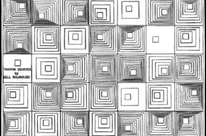
Random Squares by Bill Kolomyjec

Initially starting with this project I picked a different image, but struggled with it, so I switched to this, simpler one. That was  

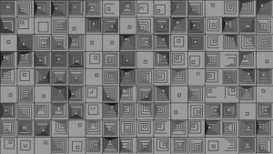
And I like the effect somewhat, but I realized that each unit was not actually independent. I therefore switched to a very similar graphic where each unit was entirely independent.

int s= 100;
//int p=s/5;
void setup(){
  //size(500,500); 
  fullScreen();
  for(int x=0; x<width; x+=s){
    for(int y=0; y<height; y+=s){
      drawSquares(x,y);
    }
  }
}
void drawSquares(int x, int y){
  int xc=int(random(s/5,3*s/5));
  int yc=int(random(s/5,3*s/5));
  int num=int(random(1,11));
  int xs=xc/num;
  int ys=yc/num;
  int p= s/num;
  noFill();
  stroke(0);
  rect(x,y,s,s);
  for(int i=1; i<num; i++){
    //rect(x+i*xc/num,y+i*yc/num,x+i*(x+xc)/num,y+i*(y+yc)/num);//I like it
    rect(x+xs*i,y+ys*i,(p*(num-i)+s/5)*4/5,(p*(num-i)+s/5)*4/5);
  }
  rect(x+xs*(num),y+ys*(num),s/5*4/5,s/5*4/5);
}

I am not sure that all of the offsets (like the factor of 4/5) are quite right, but the effect is satisfactory.