Interesting and informative piece. The section discussing the concept of human centered design resonated strongly with an important bit of advice Aaron gave us after the first assignment. That piece of advice was to always consider the audience/customer/user and all the possible ways they might use your product when designing the item because chances are, many of them might not read the manuals and use the item the way we thought they would when we created it. I agree that the best way to design/create something is to put the audience’s needs, capabilities, and behavior first, then design something to accommodate all of it.
The Psychology of Everyday things
Comment 1.
While reading this, I was reminded a lot of another class I have taken called “Wayfinding” with Professor Goffredo Puccetti. In this course, we walked around our university’s campus and looked at some aspects of the design that were confusing, or even potentially dangerous.
One of the most common problems on campus is that people walk on the grass instead of the pathway; this I think ties into what Don Norman was saying about Human Centered Design. People will want to walk the shortest distance possible to get to their destination, and so that should be taken into consideration when laying out pathways.
This concept specifically stood out to me because it is so prevalent where I live.
Comment 2.
This reading covered a lot of interesting/useful things a designer should keep in mind. From affordances and signifiers to the amount and delivery of feedback; these are all aspects that should be considered in designing lots of things, not just concrete objects.
I like specifically how he mentions things like furniture layout are a part of design, because this is not something people think of when they hear “design”.
This ties back to my Wayfinding class which focused on the ease of navigation and understandability of a space. This too, is design, as it is an umbrella that encompasses a plethora of practices.

Emotion & Design: Attractive things work better
The Design of Everyday Things
Emotion & Design: Attractive Things Work Better
I believe it’s pretty clear from my last blog post that I agree with the arguments presented in this article. Though he repeated many of the points that were mentioned in his book, the concentration on the cognitive aspects was interesting.
Towards the end, when he mentions the Japanese lunchboxes or bentos, the concept truly came together for me. As I am familiar with the concept of a bento box and it’s aesthetic values. Bento boxes are nutritiously balanced, extremely pleasing (aesthetically), delicious and the amount of food is also perfected. The example was able to very simply explain the harmony that must occur between all parts of a product. Overall, I don’t have much more to say about this piece except that it was easily understandable.
The Psychopathology of Everyday Things – Response
There was a point in the reading where Norman talks about how a bookmark placed in a book can be a signifier. How it shows the amount of pages that are left until the end. How when a student places a bookmark they are confronted with the idea that there are ‘n’ number of pages left until it’s finally done. This was extremely relatable when reading his piece.
Although sometimes the piece seemed to drag on and Norman seemed to be repeating his point and explanation over and over again, his arguments are solid. In his conclusion about how a good design is the combination of various fields and the understanding of human nature made a lot of sense to me.
I’ve had many discussions with my brother about using Androids and how they are more ‘efficient’ and have higher capabilities. However, as a loyal iPhone user, I find the appeal of the phone not centered around its usability but also its aesthetics, simple to use and easy to understand interface, compatibility with other devices etc. . Perhaps it’s human to like simple and pleasing rather than ugly but efficient.
Also, I found it funny how he was describing a watch that had social media and smartphone like capabilities because all I kept thinking was: Apple Watch!!!
Emotion & Design: Attractive things work better Response
Perhaps “The Design of Everyday Things” takes a different turn after the first chapter, but none of what was written in this article seemed incongruent with what was written in the book. While “The Design” emphasizes the clear transmission of functions, it does not suggest to me that this would necessarily make things uglier. In fact, when he identifies that “[g]reat designers produce pleasurable experiences”, I could easily see aesthetics being implied in this. It is certainly true that the importance of emotion was not thoroughly analyzed and that there is a great deal of interesting and relevant information in the article, but if feels like a natural extension of the design philosophy previously mentioned. If the primary mechanism for determining the quality of a design is the response people give to it, then pretty things will obviously score higher than equally functional ugly things.
The Psychopathology of Everyday Things Response
Unlike the previous readings, I don’t have much to say about this reading, as I found that it was almost exclusively new and comprehensible ideas to me. While my experiences with a number of designs differ from the authors, especially concerning the sink, his identification of the problem and proposed solution both seem feasible to me. However, that does bring me to the one questionable moment I found in his analysis. In his introduction of human centered design he mentions that part of the process is “to avoid specifying the problem as long as possible but instead to
iterate upon repeated approximations.” While this clearly works as a stopgap, throughout the rest of the chapter he is able to clearly identify what is wrong and what the solution could be for a number of bad designs. These solutions also all fit together in a consistent framework, and so it seems to me that with some development it should be possible to remove the iterations and allow the minimum requirements for a good design in any situation to be known before the object is ever made, much less used. There would almost certainly be multiple “correct” solutions, but this seems to me to be the point at which the engineers would get on board and the difficulty in communication between departments, as he identifies at the end, would lessen.
~Can’t Touch This Sweater ~ Analog input into a creative LED
Premise:
Have you ever been on a date and the other person begins to be… a little too handsy?
Well say no more, because the “Can’t Touch This Sweater” is the perfect product for you.
Not only will you know that your date is being rude because of their hands, but the flashing red light will show other people that your date is being a bit too handsy.
What do I mean? How does this product work?
The product comes in an adorable black colored sweater, with a cute traffic light on it.
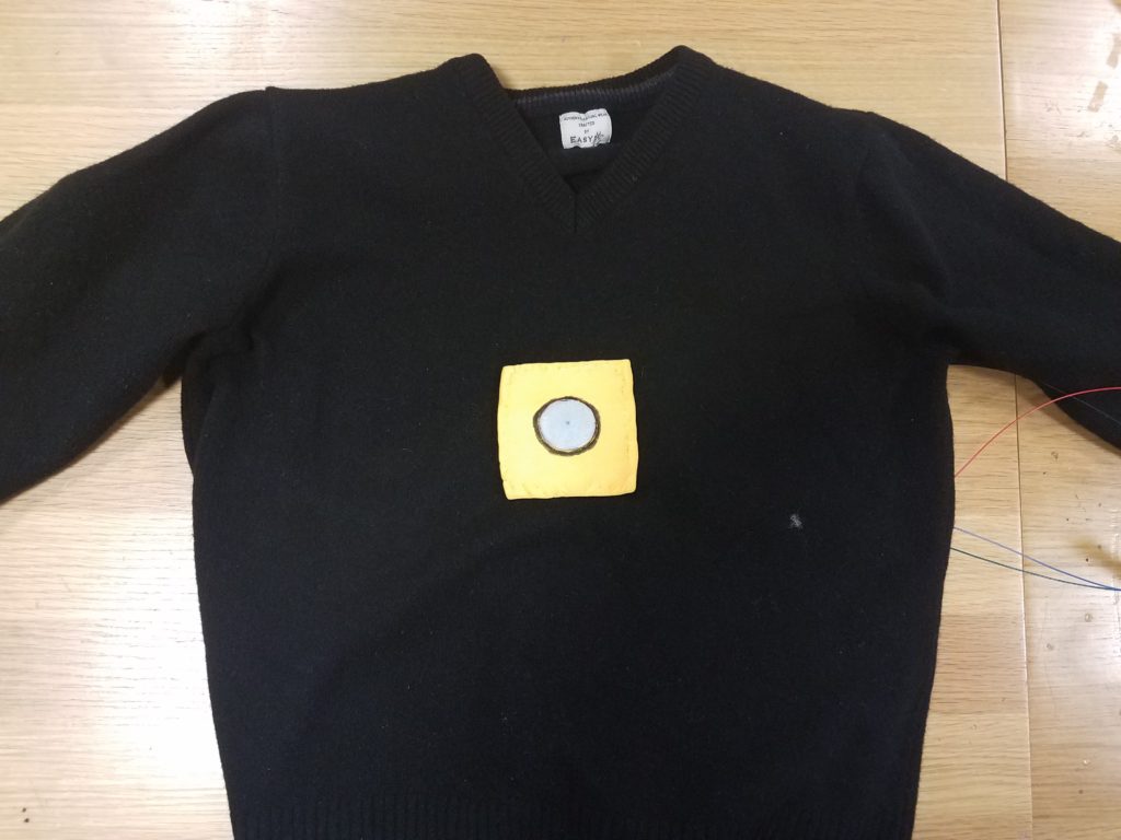
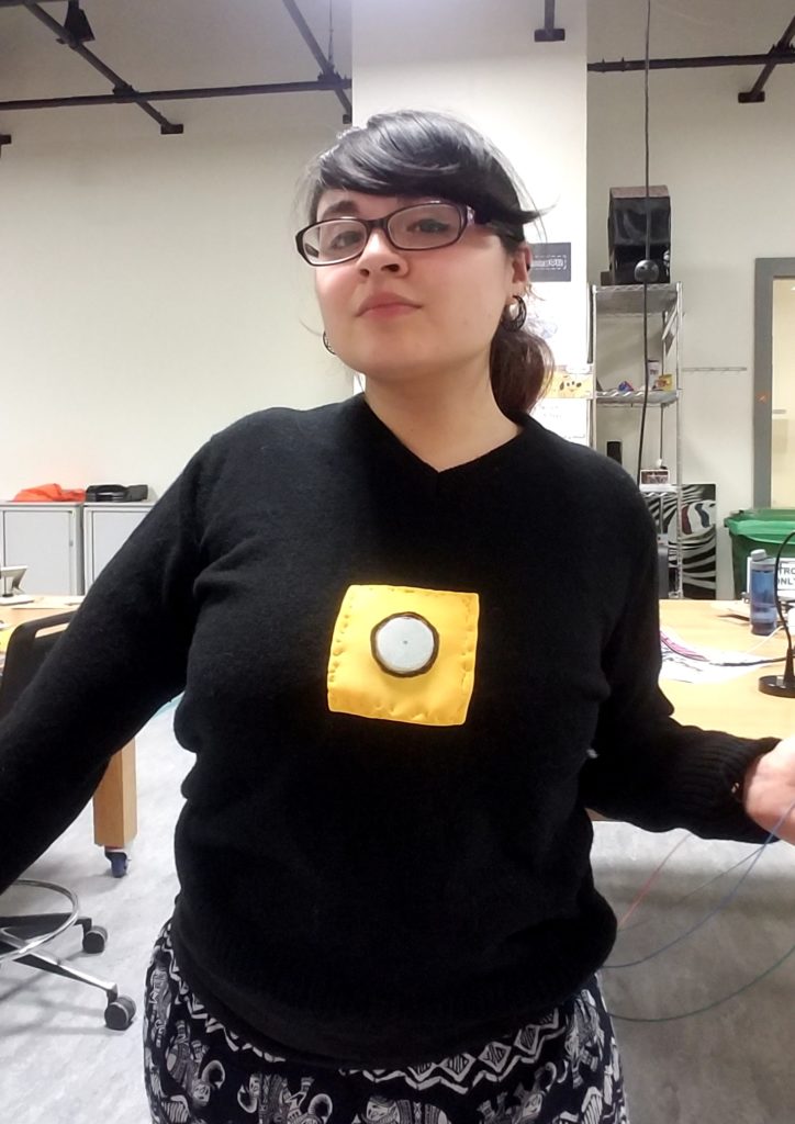
Ok ok, so now you know how it looks, but what exactly does this thing do?
Well, the sweater is at a constant green light as such:


And in the circuit, there is a soft potentiometer. This is the analog input source.
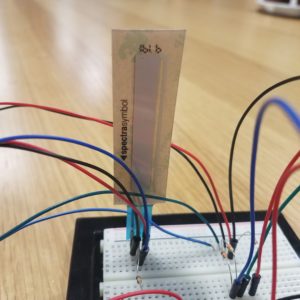
This potentiometer is meant to be around the chest area of the woman. (Sadly, this was not possible to do on my model due to technical problems.)
Therefore, when there is no contact on the chest area (ie, the soft potentiometer) the light is green. This means everything is ok.
On the outskirts of the soft potentiometer, if there is a pressure, it will still be green. BUT THIS IS ONLY FOR A VERY SMALL SECTION OF THE POTENTIOMETER.
When the person’s hand begins to come too close to the soft potentiometer area, the light will turn yellow as so. (This area means it is approaching a place it shouldn’t be, but is not quite there yet.)


And then finally, when the person’s hand is about to reach the chest zone, the light turns red. This indicates that their hand has gone too far and they need to BACK OFF. (Unless consent is given; then by all means continue.)


And so, here is a video demonstration.
How I made it:
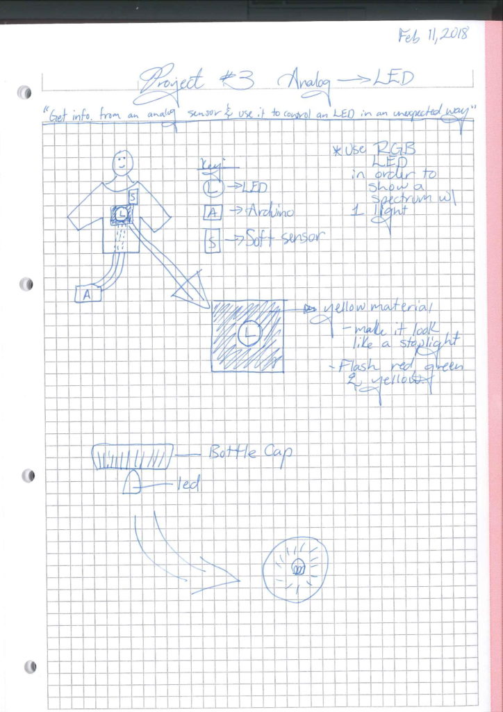
From there, came the physical sweater part.
INSERT IMAGE
In my circuit, there is a soft potentiometer and an RGB LED.
Here is the website that helped me set it up.
https://learn.sparkfun.com/tutorials/sik-experiment-guide-for-arduino—v32/experiment-10-reading-a-soft-potentiometer
As for the code, the soft potentiometer works in a range of 0-1023. Taking this, I divided the strip into approx:
green —> 20% of the strip
yellow —> 50% of the strip (yellow in an RGB LED is done by activating both the RED and GREEN)
red —> 30% of the strip
(in this order.)
Here is my code:

*The sweater will not soon be in stores. It was inspired by light-up Christmas sweaters. The next model will have a switch to turn off the green light.*
Assignment #3
1) I wanted the LED to light up when the brightness was low and vice versa using the LDR. I had multiple ideas of how to build the circuit, but every-time I tried executing my idea I struggled with actually getting the plan to be successful. One thing I could do better next time is to actually sketch out my idea using diagrams. I looked at an Arduino tutorial to help clarify how I should set the circuit: https://www.youtube.com/watch?v=4fN1aJMH9mM. However, I wired it in a different manner that was more familiar to me.
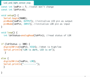
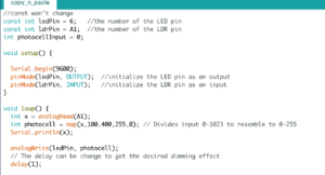
2) I wanted to take one step further and work on fading the lights in and out instead of the lights abruptly changing every time it was dark and bright. I wanted the LED to vary in brightness depending on how dark the setting was. I implemented the code as seen below, however that only contributed to the dimming of the LED. I did not achieve the results I desired.

3) I learnt that the problem arose from the fact that the ledPin was at 7, which was not an analog output (PWM). Only when I switched it to a PWM would the LED fade. Adham helped me write my code more efficiently (ex. adding a map function instead of doing the analogRead under the loop function in the Example #2). However, even after writing the code efficiently and switching the ledPin two its proper location, the LED would brighten very subtly when it was dark. The change almost appeared non-existent. Only after switching around the values in the map function (by looking at the highest and lowest values from the serial monitor) was I able to see a difference in the fading of the light.
