For an article focused on design, the article sure looked and was formatted terribly.
Whether this was intentional or not I am not sure, but let me explain why I say this.
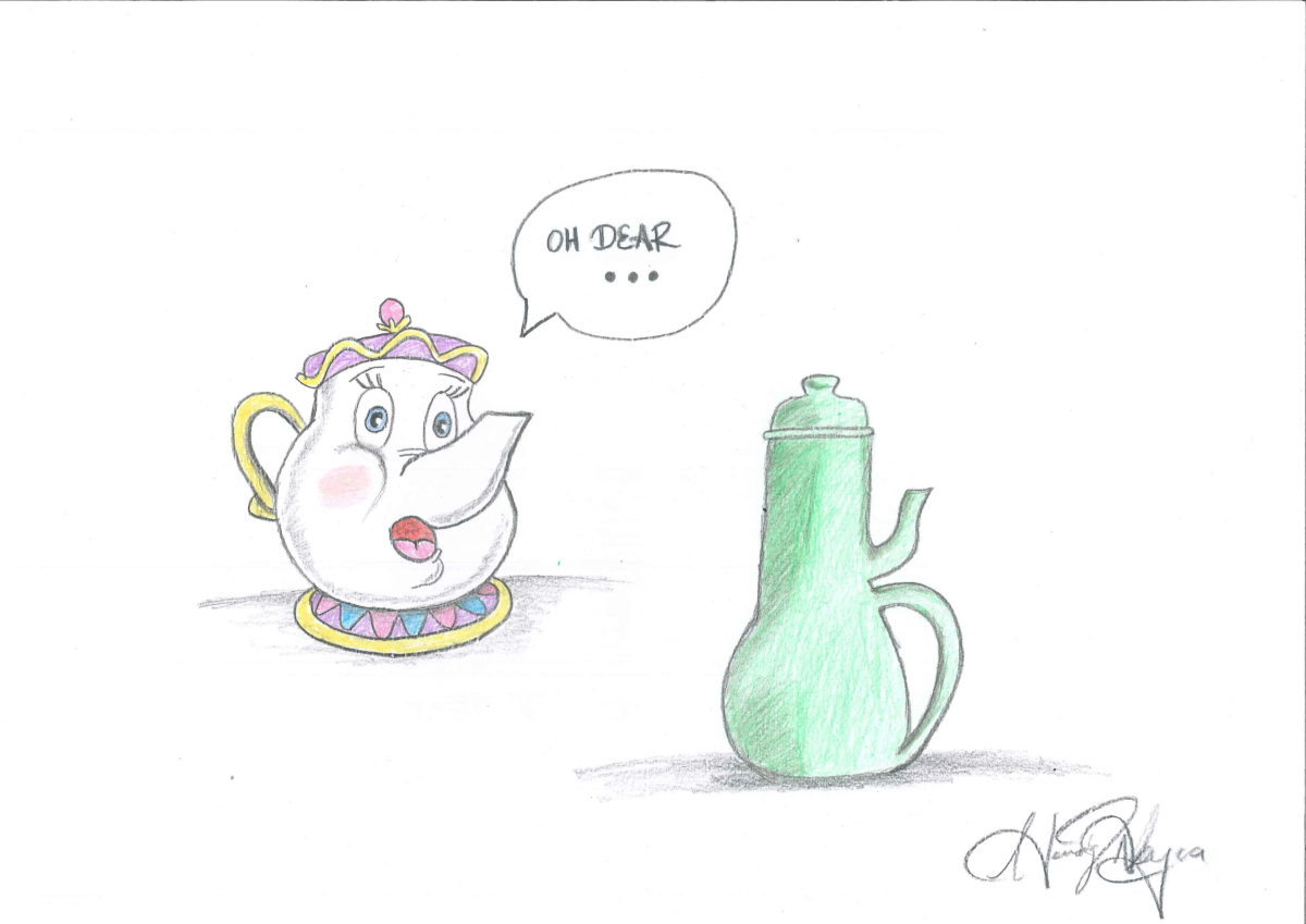
Firstly, he provides some images of the teapots he wants to talk about but the images are so tiny. I couldn’t really see the details he was talking about in them. Again, this was maybe a personal choice to make the article seem more, I’m not sure, professional? But in truth it just inhibited me from following along as smoothly as the pictures intend in the first place. Or the same thing with the book cover he wanted to show. Too. Small. To. See. The. Detail. He. Wants. To. Point. Out.
Secondly, the actual text formatting was unpleasing to the eye. He has sections in which he wants to focus on a specific topic and he uses the exact same font and size to indicate this.
Moving on from his aesthetic choices, and aesthetics being integral to his point, his article was functional in conveying what was intended.
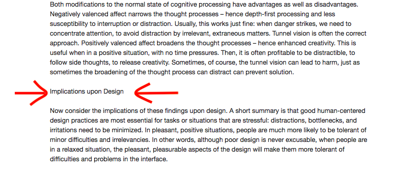
I like his descriptions of affect and behavior, although I can’t really think of other positive affects making it easier to do difficult tasks apart from his gift idea. That may be a personal issue, but that side of the spectrum seems less plausible than the other.