Emotion & Design Response

I’m going to start off by saying that I really quite liked this piece. Since middle school, I’ve always been an adamant believer in the concept: Attractive Things Work Better. In fact, I’d like to take it one step further by saying: Using beautiful things may even make the user more productive.

Most people believe that in a certain price range, the item with the best technical specifications and the most functions is the one with the best value. The aesthetic design, compatibility (with software and other accessories or products), and other less “tangible” qualities are often overlooked. In my opinion, these less concrete elements play just as important of a role as the tech specs in creating the best possible user experience, contributing significantly to its “value”, though in a less tangible way. As Norman stated in the second last paragraph, “good design means that beauty and usability are in balance”.

Take Apple as an example. Many Apple products such as the MacBook Pro or the iPhone do not have technical components that even come close to rivaling those employed by other products of other brands in the same price range. Yet, there are many (although still a minority) that choose to go with Apple’s products because of their soft qualities (i.e. sleek design, interconnectivity, aka Apple Ecosystem, etc). Throughout the years, Apple has stuck by its core values by putting as much emphasis on design and software as its hardware. Yes, they have been vehemently criticized because of the subpar specs, but they’ve also managed to garner a loyal customer base that appreciate the soft qualities of its products. Seeing how they’re currently still the world’s most profitable company, I’d say it worked out pretty well for Apple.

Emotion & Design: Attractive Things Work Better

For an article focused on design, the article sure looked and was formatted terribly.

Whether this was intentional or not I am not sure, but let me explain why I say this.

Firstly, he provides some images of the teapots he wants to talk about but the images are so tiny. I couldn’t really see the details he was talking about in them. Again, this was maybe a personal choice to make the article seem more, I’m not sure, professional? But in truth it just inhibited me from following along as smoothly as the pictures intend in the first place. Or the same thing with the book cover he wanted to show. Too. Small. To. See. The. Detail. He. Wants. To. Point. Out.

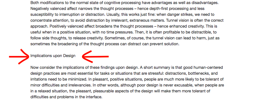
Secondly, the actual text formatting was unpleasing to the eye. He has sections in which he wants to focus on a specific topic and he uses the exact same font and size to indicate this.

Example found in the text.

Moving on from his aesthetic choices, and aesthetics being integral to his point, his article was functional in conveying what was intended.

I like his descriptions of affect and behavior, although I can’t really think of other positive affects making it easier to do difficult tasks apart from his gift idea. That may be a personal issue, but that side of the spectrum seems less plausible than the other.

The Design of Everyday Things Response

Interesting and informative piece. The section discussing the concept of human centered design resonated strongly with an important bit of advice Aaron gave us after the first assignment. That piece of advice was to always consider the audience/customer/user and all the possible ways they might use your product when designing the item because chances are, many of them might not read the manuals and use the item the way we thought they would when we created it. I agree that the best way to design/create something is to put the audience’s needs, capabilities, and behavior first, then design something to accommodate all of it.

The Psychology of Everyday things

Comment 1.

While reading this, I was reminded a lot of another class I have taken called “Wayfinding” with Professor Goffredo Puccetti. In this course, we walked around our university’s campus and looked at some aspects of the design that were confusing, or even potentially dangerous.

One of the most common problems on campus is that people walk on the grass instead of the pathway; this I think ties into what Don Norman was saying about Human Centered Design. People will want to walk the shortest distance possible to get to their destination, and so that should be taken into consideration when laying out pathways.

This concept specifically stood out to me because it is so prevalent where I live.

Comment 2.

This reading covered a lot of interesting/useful things a designer should keep in mind. From affordances and signifiers to the amount and delivery of feedback; these are all aspects that should be considered in designing lots of things, not just concrete objects.

I like specifically how he mentions things like furniture layout are a part of design, because this is not something people think of when they hear “design”.

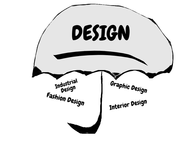
This ties back to my Wayfinding class which focused on the ease of navigation and understandability of a space. This too, is design, as it is an umbrella that encompasses a plethora of practices.

Emotion & Design: Attractive things work better

Norman definitely repeated a lot of points in this article from his book. I found what he said about the aesthetics having a positive emotional response rather than a rational response very interesting. Thinking back about the introduction of the iPhone, and the following industry-wide switch from physical keyboards on phones to on-screen keyboards, I’m sure plenty of people including me miss the physical keyboards on the blackberry phones that we had. However, I would never even consider switching back. Today’s screens on phones are gorgeous, and I would not sacrifice such screen estate for a physical keyboard.

The Design of Everyday Things

lately, the word “Design” has become a buzzword that is thrown around everywhere to the point that it almost lost its meaning. All companies are integrating ‘Design’ into their products, all the labs are renaming themselves to ’something Design lab’, etc etc. So it was refreshing to read about design from one of the pioneers of the field of the field of design in general and Human-Centered Design in specific, Don Norman A.K.A The Design Don himself. The Design of Everyday Things is widely considered to be one of the fundamental books on design.
I specifically like what he was saying about Experience Design, because it is an aspect of design that I notice is often overlooked. One example of experience design that comes to mind is the BMW i8. It is a hybrid car, having both an electric and a small gasoline engine, and it is incredibly quiet. It is absolutely a feat of engineering to have a supercar that is this quiet. However, BMW realized that the roaring sound of an engine is an important part of the experience of owning a supercar and decided to feed artificial engine sound through the speaker.
All that being said, there is a problem with The Don’s approach of Human-Centered Design. HCD doesn’t allow much room for technological innovation. It is a design process that improves current technologies in a way that the user wants. However sometimes, as Steve Jobs would say, the user does not know what he wants. If Jobs followed the HCD approach to design, the iPhone would not be the way it is today. We may still have had physical keyboards on phones! Whether that’s a good or bad thing is up for debate.
P.S. Here’s a good video about the ’Norman doors’ discussed in the reading: https://www.youtube.com/watch?v=yY96hTb8WgI

Emotion & Design: Attractive Things Work Better

I believe it’s pretty clear from my last blog post that I agree with the arguments presented in this article. Though he repeated many of the points that were mentioned in his book, the concentration on the cognitive aspects was interesting.

Towards the end, when he mentions the Japanese lunchboxes or bentos, the concept truly came together for me. As I am familiar with the concept of a bento box and it’s aesthetic values. Bento boxes are nutritiously balanced, extremely pleasing (aesthetically), delicious and the amount of food is also perfected. The example was able to very simply explain the harmony that must occur between all parts of a product.  Overall, I don’t have much more to say about this piece except that it was easily understandable.

The Psychopathology of Everyday Things – Response

There was a point in the reading where Norman talks about how a bookmark placed in a book can be a signifier. How it shows the amount of pages that are left until the end. How when a student places a bookmark they are confronted with the idea that there are ‘n’ number of pages left until it’s finally done. This was extremely relatable when reading his piece.

Although sometimes the piece seemed to drag on and Norman seemed to be repeating his point and explanation over and over again, his arguments are solid. In his conclusion about how a good design is the combination of various fields and the understanding of human nature made a lot of sense to me.

I’ve had many discussions with my brother about using Androids and how they are more ‘efficient’ and have higher capabilities. However, as a loyal iPhone user, I find the appeal of the phone not centered around its usability but also its aesthetics, simple to use and easy to understand interface, compatibility with other devices etc. . Perhaps it’s human to like simple and pleasing rather than ugly but efficient.

Also, I found it funny how he was describing a watch that had social media and smartphone like capabilities because all I kept thinking was: Apple Watch!!!

Emotion & Design: Attractive things work better Response

Perhaps “The Design of Everyday Things” takes a different turn after the first chapter, but none of what was written in this article seemed incongruent with what was written in the book. While “The Design” emphasizes the clear transmission of functions, it does not suggest to me that this would necessarily make things uglier. In fact, when he identifies that “[g]reat designers produce pleasurable experiences”, I could easily see aesthetics being implied in this. It is certainly true that the importance of emotion was not thoroughly analyzed and that there is a great deal of interesting and relevant information in the article, but if feels like a natural extension of the design philosophy previously mentioned. If the primary mechanism for determining the quality of a design is the response people give to it, then pretty things will obviously score higher than equally functional ugly things.

The Psychopathology of Everyday Things Response

Unlike the previous readings, I don’t have much to say about this reading, as I found that it was almost exclusively new and comprehensible ideas to me. While my experiences with a number of designs differ from the authors, especially concerning the sink, his identification of the problem and proposed solution both seem feasible to me. However, that does bring me to the one questionable moment I found in his analysis. In his introduction of human centered design he mentions that part of the process is “to avoid specifying the problem as long as possible but instead to
iterate upon repeated approximations.” While this clearly works as a stopgap, throughout the rest of the chapter he is able to clearly identify what is wrong and what the solution could be for a number of bad designs. These solutions also all fit together in a consistent framework, and so it seems to me that with some development it should be possible to remove the iterations and allow the minimum requirements for a good design in any situation to be known before the object is ever made, much less used. There would almost certainly be multiple “correct” solutions, but this seems to me to be the point at which the engineers would get on board and the difficulty in communication between departments, as he identifies at the end, would lessen.