
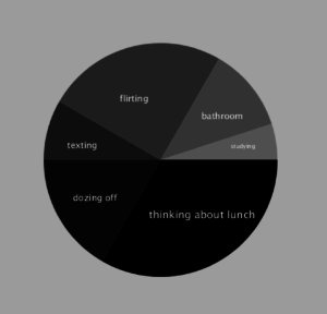
I interviewed some individuals from my computer science classes about the things that they actually do during class and consolidated the responses into 6 main categories: thinking about lunch, dozing off, texting, flirting, using the bathroom, and actually studying. I then visualized the data via a pie chart that I created using arcs.
I created the data by assigning values (minutes) to each category based on the responses. I then generated the start and stop markers for each slice of the pie by calculating the percentage of class time spent doing each task.
This is a screenshot of my chart:
This is my code:
float data[];
float total = 0;
float StempVar = 0;
float EtempVar = 0;
size(600,600);
String[] input = loadStrings(“input.txt”);
println(input.length);
data = float(split(input[0], ‘,’));
println(data.length);
noStroke();
for(int i = 0; i < data.length; i++){
total = total + data[i];
println(total);
}
//for(int a = 0; a < data.length; a++){
// println(data[a]);
//}
for(int i = 0; i < data.length; i++){
//int colour = int(random(0,255));
fill(i*30);
StempVar = StempVar + (2*(data[i]/total));
//println(StempVar);
EtempVar = (StempVar – 2*(data[i]/total));
println(EtempVar);
arc(300, 300, 400, 400, EtempVar*PI, StempVar*PI);
}
fill(255);
textSize(18);
text(“thinking about lunch”, 280, 400);
textSize(15);
text(“dozing off”, 150, 370);
text(“texting”, 140, 280);
text(“flirting”, 230, 200);
text(“bathroom”, 370, 230);
textSize(10);
text(“studying”, 420, 280);