Emotion & Design: Attractive things work better – Response

In this article, Norman emphasizes that how aesthetics can improve user experience after some people criticize Norman for overlooking the values of aesthetics in design.

I never see the usability and aesthetics at odds. They are both contributing to the overall user experience. After all, it is up to the users to decide whether a design is good or bad.  A beautiful car that is broken may be useless, but an ugly car that is functioning may also be very frustrating to the driver. However, the focus should really depends on what kind of product we are talking about. A designer should concern too much about the colour of the drop-down oxygen face mask on airplanes as long as they flow oxygen properly when deployed. However, when it is possible, when do we try to make our product both functionally sound and aesthetically pleasing?

The Psychopathology of Everyday Things – Response

The glass door with no markings that indicate where to push, the sliding door that could be a push door or a pull door, the sink that is impossible to empty… all of those spectacular design failures are common objects in our daily lives. The awkward interactions and experience with this kind of objects are too familiar to me. I do not have to leave my dorm to find examples. Every student dorm on campus has a drawer with three drawer boxes. On my move-in day, two of my roommates and I spent almost an hour trying to figure out how to open one of the drawer boxes until we broke it by trying to force open it. It took me an entire semester until someone told me the secret:  “you have to have all drawers completely shut before you open any drawer”. I sometimes use it as a joke to mock how “stupid” I can be sometimes. However, I completely agree with the author’s view here: if only “smart” people can figure out how to work something but not the majority “stupid” people, then the design of that thing is at fault, not the people. It is the duty of machines and those who design them to understand people. It is not our duty to understand the arbitrary, meaningless dictates of machines. Designers need to focus on the experience of people who are completely clueless rather than people who had experience interacting with similar mechanisms before.


Project Super Straw (2.0)


The new and improved Super Straw will make your drinking experience even better with cooler light displays. Notice that a different light or light display would be turned on every time you take a sip from the straw. It goes like RED-> BLUE -> YELLOW -> YELLOW-BLUE-RED and FADE. The cycle then repeats itself.

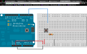
Basic circus graph

However, I encountered a small problem with the fading effect. The lights do not seem to completely turn off in the end.

Then I changed while (brightness > 0 ) to while (brightness >= 0 ) in the beginning of the part of the code that is in charge of the fading effect, then the problem was solved. It seemed that I need to allow the brightness to go to or below 0 to make the lights completely turned off.

After debugging

link to my code: https://github.com/ross67/IntroToIm/blob/master/Project%20Super%20Straw%202.0.txt

The Jump to Universality – Response

Even though I do not quite understand the connection between this text and our course material, it is a very interesting read.

With gradual improvement of a system, at some point of history, one improvement would make the system “universal”, gives the system ability to cover every possible instance and potential problem.

However, I do not particularly agree with the author on one point regarding the “universality” of language. My first language Chinese is one of the few languages in the world that do not have an alphabet. Yet I believe it is just as “universal” as any other alphabet based language. One of the points the author brought up is that an alphabet can accommodate all potential words in a language and it would help people to pronounce a  foreign word. I have not heard of anyone creating a new character in my life, yet new words and concepts are imported into the system everyday. We do this by combining existing concepts together or transliterate a foreign word using characters that have similar sounds.  Perhaps in the old times when people did have the need to create new characters. However, I do not see the difference between that and the time when Shakespeare coined a whole bunch of new words for the English language.

The Art of Interactive Design – Response

Almost every time, I can sense the sense of confusion and even a little mistrust when  I tell someone I study “Interactive Media”. Then after a brief pause, I always feel obliged to break down the so-called “Interactive Media”: “You know, we make websites, circuits, videos, machines and stuff.” I often explain the “media” part but not quite the “interactive”because I don’t feel that I understand this word well enough myself. This reading certainly gives me a better understanding.

Conversations with someone who actually listens, thinks and speaks are meaningful conversations; Interactions with something that listens, thinks and speaks are “interactive” interactions. It really makes me think when the author states that most movies, games (non-computer), theatre, dancing and reading are not “interactive” but at most intensive “reaction” “participation”.  As interactive designers rather than graphic designers, we should not let the form or the media limits our interactive design choices. The cycle of “listen-think-speak” between a human and a machine is the utmost important element in an interactive design.

Project Super Straw

Project Super Straw

It takes forever to know whether your water is actually going up your straw? Wanna look cool and different than everyone else even though you are doing the exact same thing? Or you just want to add some more fun to your mundane sipping experience? Look no further than the Super Straw!

You will know your water is half way through your straw for sure when the blue light is turned on because electric current passes through the liquid from one end of the wire to the other.

The beginning

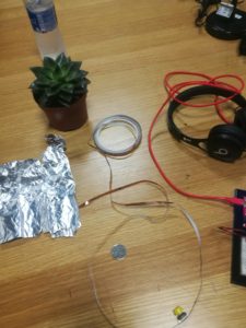
It took me a while to think of ideas so I just tried out some everyday objects that conduct electricity, including tin foil, coins, copper tape, cactus and water.

testing

Then I entertained the idea of using water as a conductor. However, in the beginning, the light was too dim. So I dissolved a lot of salt in the water and the water became more conductive.

Now enjoy a little demonstration of the magic of Super Straw with music!!

There are no electrons

“There are no electrons” by Kenn Amdahl provides me with a new perspective of how an educational book could be written. It was a very easy and fun read since a lot of it was stories rather than plain instructions and descriptions. I know effective story-telling is the best way to reach people emotionally, but I did not know a good story can also teach people the fundamentals of the electron theory and challenge this presently well-accepted theory at the same time.

Most of the time, the author not only explains what things are, but also why they are what they are, how they came to be and what flaws there are in a light-hearted way. For example,  the “positive” and “negative” current” could as well be called “Bartholomeow” and “Afred” and they wouldn’t be less accurate.

The biggest feature of this snippet of text is perhaps that it ridicules the electron theory and the entire scientific community. There are still many unexplainable behaviours and phenomena involving electrons, yet we are too indulged in our “scientific advancement” to challenge some of the “fundamental” theories anymore. After all, they are only “theories”.

The biggest surprise for me is that I actually remember a lot about the electron theory even though the article seems to be anti- electron theory. From now on, I will replace voltage with “need-to-party” and current with “traffic”.