‘A Brief Rant on the Future of Interactive Design’ and ‘Responses: A Brief Rant on the Future of Interaction Design’ -Response

The most striking phrase for me in this reading was ‘intuitive design’. I find it incredibly interesting how we subconsciously create movement that is for an intended purpose in several everyday occurrences and never realize what we are actually doing.

I liked the idea of exploring the capabilities of our hands- I think that the author makes a valid point in the way which we are able to do so much with our hands and that with technological advances we may be diminishing our capabilities. He claims that in the ‘Picture Under Glass’ we are subjecting ourselves to a medium that is not a dynamic medium that we can see, feel and manipulate. Although I understand his point, I feel like he misjudges the ability of swipes and small hand gestures to be a part of human capabilities; they are not any less complex than other movements we may use to interact with an object. An example of this is the new iPhone 10- if you go to use it for the first time, you need to learn these ‘swiping’ abilities, going to prove that this movement is not a simple, straight-forward one. Rather, it is one which many humans cannot understand, like my grandparents.

I really liked the part when he talked about our bodies moving in space, although he used it as an argument against the said swiping motions that I say is more complex than he thinks.

I think in his response he argues his points well, although I still disagree that using a single finger is ‘dumbing down’ the idea, like toys for children. Yes, I agree that the single finger is not the entire capability of an adult human, but I think that this movement as a capability should not be overlooked.


‘A Brief Rant on the Future of Interaction Design’ & ‘Responses: A Brief Rant on the Future of Interaction Design’ – Response

‘A Brief Rant on the Future of Interaction Design’

This reading allowed me to learn a new term, “Picture Under Glass”. I think I’ve always taken for granted the technology that was offered to me and so whilst using my phone or my iPad, it didn’t really seem to me that I was “denying my hands what they do best”. After reading his argument, I could see where Victor was coming from – to look at the potential of human capabilities. Although I do think that he has a fair point, I wonder what could be some sort of technology that would be able to achieve that goal and make it interesting at the same time. I guess right now what everyone wants to see are those screens that come out of no-where that acts like a transparent iPad that you always see in movies.

‘Responses: A Brief Rant on the Future of Interaction Design’

Victor mentioned that he was interested in tools for creating and understanding and that “deep understanding requires active exploration” but I think that in this day and age, there is a general liking for items (especially electronic devices) to be smaller and easy to use – they are easily accessible. His definition of active exploration is being able to take full advantage of the body and mind but as I hinted at in my previous response (up top), I still question how practical that would be.

“Responses: A Brief Rant on the Future of Interactive Design” Response

I appreciated the question on whether Victor was advocating for further use of the stylus, physical keyboard, sticks and rocks. He answered that he was not, that he was advocating for a dynamic medium to see, feel and manipulate things. I wish Victor went further into explaining what he meant by this dynamic medium, although it was a ‘rant’ and there was a point in him providing no solution, I was hoping he could still provide some sort of example for greater understanding of his argument. I also found Victor’s view on “Waving My Hands In The Air” interesting, he didn’t find it positive as it throws off one’s proprioceptive senses. Lastly, I found the “finger-blind” comment interesting as I have noticed people believe in the intelligence of the human species when they see scenarios such as little kids playing with an iPad. They view the action with a sense of pride. However, if we don’t use our fingers in childhood, the rich network of nerves become impoverished which actually has an impact on one’s development. Intelligence can be misused in so many ways.

A Brief Rant on the Future of Interactive Design Response

Victor makes a compelling argument on how the central component of interactive future are hands. I had never considered his claim on how most future interaction concepts completely ignore the use of hands, which feel and manipulate things. I took my hands for granted when considering interactive design, and didn’t realise the potential they hold to revolutionise interactive design. The debate on whether to get rid of tactile for the visual was fascinating. There is so much information that the senses in our hands and fingertips receive, I am curious as to how we came to the stage where we began to aim for a “less dynamic” medium. One of my favourite quotes from Victor that accurately summarises his argument is, “claiming that Pictures Under Glass is the future of interaction is like claiming that black-and-white is the future of photography”.

Romeno’s Response To A Brief Rant on the Future of Interaction Design

To me, A Brief Rant on the Future of Interaction Design, changed my perception on the future of handheld devices. I myself had the vision of the, “Pictures Under Glass” as the future of technology.

As the author analyzed everyday objects that we use and emphasized on how we overlook the complexities in them, I was surprised with my ignorance. I since then have been observing everyday actions meticulously and realized really how complex they are.

Even though I learned a lot about the perception of people’s idea of the future of technology, the author hasn’t given a solution or a alternative way to manipulate technology other than using our fingers . The author does respond to this question by saying it is simply a rant. However, he himself said that he “…had the opportunity to design with real working prototypes…” so this would not simply  be a rant as he understands the problem and one would expect him to find a solution or at least suggest one in the article.

Assignment 3

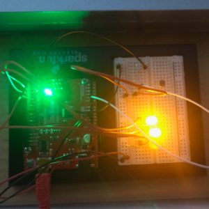
For this assignment, I got my idea from the fact that I really struggle to get up in the morning. All throughout high school, I was the irresponsible child who my mum had to wake up at least twice for me to actually get out of bed. Before I started university, my entire family worried that I won’t wake up on time for my classes. In order to be the responsible adult that I’m expected to be, I decided to prevent this problem by adopting two solutions: firstly, to not have any classes before 11:50 and secondly, to sleep by the window with some sort of light on. So instead of wasting electricity all night, I created something that turns on to wake me up in the morning.

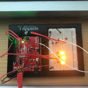
There are three LED lights (l pretended that three LED lights would be bright enough to wake me up).

This circuit uses a photo resistor as the analogue input. The amount of light detected by the photo resistor is used to tell approximately what time it is – “how urgent it is that I wake up”.

The first light is made to turn on around 6:30 when the light reading value is 5. This means that I have enough time to go for a quick run at the gym, have breakfast, take a shower, do a lot of reading, have lunch and grab a coffee before my class at 11:50.

By 8, the second LED turns on at light reading value of 600. This still means that I can gym, shower, maybe read and brunch before class.

Lastly, the third light turns on around 11 at light reading value 800. This means I won’t have time for gym or work but I can have a shower and eat something before running to class.

More LEDs can be added to “set more alarms”.

Here is the code that I used:

// Pins
const int ledPin = 2;
const int ledPin2 = 3;
const int ledPin3 = 4;
const int photoCell = A0;

// Variables
int ledState = LOW;
int lowThreshold = 5;

void setup() {

pinMode(ledPin, OUTPUT);
pinMode(ledPin2, OUTPUT);
pinMode(ledPin3, OUTPUT);
pinMode(photoCell, INPUT);
Serial.begin(9600);
}

void loop() {

int lightReading = analogRead(photoCell);
Serial.println(lightReading);

// If low light level is detected, light remains off
if (lightReading < lowThreshold) {
digitalWrite(ledPin, LOW);
digitalWrite(ledPin2, LOW);
digitalWrite(ledPin3, LOW);
}

// If light level goes up, light turns on
if (lightReading > lowThreshold)
digitalWrite(ledPin, HIGH);
digitalWrite(ledPin2, LOW);
digitalWrite(ledPin3, LOW);

if (lightReading > 100) {
digitalWrite(ledPin, HIGH);
digitalWrite(ledPin2, HIGH);
digitalWrite(ledPin3, LOW);
}

if (lightReading > 150) {
digitalWrite(ledPin, HIGH);
digitalWrite(ledPin2, HIGH);
digitalWrite(ledPin3, HIGH);
}
}

A (barely working) CPR Simulator

This week’s project is designed for CPR training. Sometimes people are not sure how hard they should compress and this device will provide them with guidance!  The light turns on after each press on the pressure censor. Blue indicates the press is too light, green just right and red too hard.

The following is my code:

int fsrAnalogPin = A0; // FSR is connected to analog 0
const int RED_PIN = 9;
const int GREEN_PIN = 10;
const int BLUE_PIN = 11;
int fsrReading; // the analog reading from the FSR resistor divider
float smoothedValue = 0;

void setup(void) {
pinMode(RED_PIN, OUTPUT);
pinMode(GREEN_PIN, OUTPUT);
pinMode(BLUE_PIN, OUTPUT);
Serial.begin(9600);
}

void loop(void) {

fsrReading = analogRead(fsrAnalogPin);
smoothedValue += (fsrReading-smoothedValue)*0.05;
delay(1);

Serial.print(fsrReading);
Serial.print(” “);
Serial.println(smoothedValue);

if (smoothedValue < 150 && smoothedValue > 50 ) {
analogWrite(BLUE_PIN, 120);
analogWrite(GREEN_PIN, 0);
analogWrite(RED_PIN, 0);

}
else if(smoothedValue<500 && smoothedValue >=150 ){
analogWrite(BLUE_PIN, 0);
analogWrite(GREEN_PIN, 120);
analogWrite(RED_PIN, 0);

}
else if( smoothedValue >=500 ){
analogWrite(BLUE_PIN, 0);
analogWrite(GREEN_PIN, 0);
analogWrite(RED_PIN, 120);

}

else {
analogWrite(BLUE_PIN, 0);
analogWrite(GREEN_PIN, 0);
analogWrite(RED_PIN, 0);
}

}

———–MISTAKES AND CORRECTIONS——

My circuit stops working as I was trying to do some final adjustment before class. I was really frustrated because the device worked before but it does not read the analog input and display the correct colour even with the same code as before. Luckily, Aaron helped me with debugging after class.

We started by commenting out most of the code and only left a very small part that works and then we slowly built on it and make sure each small part works. This is great debugging technique.

Also, the pressure censor is very sensitive to changes in pressure and the input data fluctuates a lot.   As a result, the led changes colour too rapidly sometimes. So we added :

smoothedValue += (fsrReading-smoothedValue)*0.05;

so that the changes in data are more gradual and the transitions between different colours in the LED is a lot smoother.


Project 3: Positive Feedback Loop

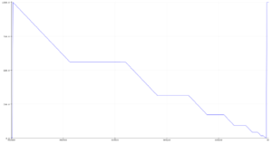
Unlike the previous projects, I was initially stumped on what to do for this project, and wanted to avoid being over-ambitious. The idea I cam up with that was somewhat interesting was actually to have the LED read itself. Obviously, this could be done internally by the software, but I set up the photo-resistor right next to the led, and set the interval for blinks to decrease at a rate mapped from  the reading on the photo-resistor. I also set up up to automatically calibrate so that all values that corresponded to just ambient light are ignored.  My personal code from last class was giving my confusing bugs and was becoming a bit of a mess, so I instead modified the blink without delay example file from arduino.

const int ledPin =  2;
const int photoresistor= A1;
int ledState = LOW; 
unsigned long previousMillis = 0;
const long initialInterval= 1000;
long interval = initialInterval;
int backgroundIntensity= 0;
void setup() {
  pinMode(ledPin, OUTPUT);
  digitalWrite(ledPin, ledState);
  backgroundIntensity= analogRead(photoresistor)*1.05;
  Serial.begin(9600);
}

void loop() {
  unsigned long currentMillis = millis();
  interval= (interval- abs(constrain(map(analogRead(photoresistor),backgroundIntensity,1023,0,10),0,10)));
  if(interval<=0){
    interval= initialInterval;
  } 
  Serial.println(interval);
  if (currentMillis - previousMillis >= interval) {
    previousMillis = currentMillis;
    ledState=! ledState;
    digitalWrite(ledPin, ledState);
  }
}


Emotion & Design Response

I’m going to start off by saying that I really quite liked this piece. Since middle school, I’ve always been an adamant believer in the concept: Attractive Things Work Better. In fact, I’d like to take it one step further by saying: Using beautiful things may even make the user more productive.

Most people believe that in a certain price range, the item with the best technical specifications and the most functions is the one with the best value. The aesthetic design, compatibility (with software and other accessories or products), and other less “tangible” qualities are often overlooked. In my opinion, these less concrete elements play just as important of a role as the tech specs in creating the best possible user experience, contributing significantly to its “value”, though in a less tangible way. As Norman stated in the second last paragraph, “good design means that beauty and usability are in balance”.

Take Apple as an example. Many Apple products such as the MacBook Pro or the iPhone do not have technical components that even come close to rivaling those employed by other products of other brands in the same price range. Yet, there are many (although still a minority) that choose to go with Apple’s products because of their soft qualities (i.e. sleek design, interconnectivity, aka Apple Ecosystem, etc). Throughout the years, Apple has stuck by its core values by putting as much emphasis on design and software as its hardware. Yes, they have been vehemently criticized because of the subpar specs, but they’ve also managed to garner a loyal customer base that appreciate the soft qualities of its products. Seeing how they’re currently still the world’s most profitable company, I’d say it worked out pretty well for Apple.

Emotion & Design: Attractive Things Work Better

For an article focused on design, the article sure looked and was formatted terribly.

Whether this was intentional or not I am not sure, but let me explain why I say this.

Firstly, he provides some images of the teapots he wants to talk about but the images are so tiny. I couldn’t really see the details he was talking about in them. Again, this was maybe a personal choice to make the article seem more, I’m not sure, professional? But in truth it just inhibited me from following along as smoothly as the pictures intend in the first place. Or the same thing with the book cover he wanted to show. Too. Small. To. See. The. Detail. He. Wants. To. Point. Out.

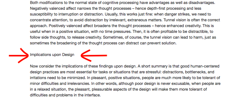
Secondly, the actual text formatting was unpleasing to the eye. He has sections in which he wants to focus on a specific topic and he uses the exact same font and size to indicate this.

Example found in the text.

Moving on from his aesthetic choices, and aesthetics being integral to his point, his article was functional in conveying what was intended.

I like his descriptions of affect and behavior, although I can’t really think of other positive affects making it easier to do difficult tasks apart from his gift idea. That may be a personal issue, but that side of the spectrum seems less plausible than the other.